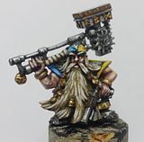
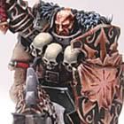
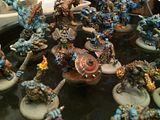
Right, I'm having real difficulties with the Angels Exemplar colour scheme. I love the scheme I put together on the Space Marine painter on the computer but sadly on the minis the scheme just doesn't suit the character of the marines they're meant to represent. Try as I might the red and white just isn't looking evil enough. So I'm looking for new ideas of what to do. This is what I've come up with so far. Whilst I like it, it's possibly a little too standard chaos space marine for my liking. I was also considering maybe using blue. If anybody has any suggestions I'd be glad to hear them.


3 comments:
Get back to fantasy, you! *shakes fist*
Heh, uhm, while the new black and red look, looks more 'evil' than the red and white, I think it's.. too stereotypical and 'used'.
I'd say go with something light, it'll add to the whole 'been good, turned bad' thingy, although giving it a more realistic feel. Just 'cos you're evil, you don't have to see yourself as evil. I f you know what I mean...
So why adopt a stereotypical bad-guy-look?
Yea, I know Warhammer (40 000) is kinda cartony, and stereotypical, but I think you've given your fantasy army such a realistic and original colourscheme, that it'd be a shame for you to not try something original with your futuristic warriors.
So I say, go for white/light!
Thanks Noeste, I'm painting Be'Lakor at the same time as working on my Chaos Marines! I'll be posting an update on that in the not too distant future :)
I agree that the black and red is too stereotypical. When I started coming up with the background and fluff I wanted what you said about how they were good and turned bad. That's why I picked the red and the white and why I wanted them to keep their original chapter name as I didn't want them to just shed their identity because their beliefs changed. I guess I lost sight of that original goal a little so thank you for bringing me back around to it! I'm going to work on something with the original colours and see if I can make them click.
Thanks for your comment and check back soon!
Hey Elazar!
Thanks for stopping by my blog earlier, just came across yours and I really like what I see. I like this colour scheme, it's certainly Chaos, but I think the scheme could greatly benefit from the white colour you mentioned. I guess it would be difficult making white look scary, especially for Chaos, but have you tried maybe painting a pad or piece of armour white, and then painting it to appear as if it was slightly aged, stained or discoloured around the edges. It might add a bit of depth to the white whilst fitting in nicely with the feel of Chaos.
Post a Comment