
That's what I've done so far.
I'm thinking maybe something like:

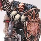
I thought about the chapter name and wondered if maybe something like gold would be a more suitable colour scheme for them.
Which do people prefer the blue and red or the gold and red idea. I'm thinking with the Gold scheme robes on marines that have them will most likely be black or red and on the blue I might bring the white back in with the robes.
Apologies for the constantly changing colour scheme ideas!










4 comments:
I like the gold armor with the red shoulder pads, but I would make the little border areas on th armor and the imperial eagles a more silver color or anything to differ it from the main armor plates.
I like the gold as well, but I think you should experiment with some different washes to make it look a little more "brassy". Looking pretty sweet so far!
I like it, but it needs some more higlighting and shading! Also, I think that it might look better with some colour on the boots, you could make them red like the shoulderpads, or black like the backpack. If not, I feel it gets just a little bit too much gold?
I like what you did with that helm, looks good. Also the highlighting around the eyes, makes them stand out.
Keep it up!
Thanks for the comments guys. Yes it definitely does need some more colour just to break up the gold a little. The highlighting hasn't really been started yet, apart from the eyes on the helm. Wanted to do a mock up before I put too much work in! :)
I like Noeste's idea of maybe using the boots to get some more colour in, I think I'd go for the red as I'd like to get some of the red into the colour scheme.
Post a Comment